Digital Painting Lesson 3: Textures, Part One

I’m taking a course at Schoolism.com called “Digital Painting with Bobby Chiu.”   The courses are usually nine weeks long and they work like this: each week I watch a video of the lesson—usually around 90 minutes in length—and I have until the following week to turn in my assignment. As I am working on the assignment for the next week, Bobby is grading my previous assignment, which involves creating a video of him correcting and drawing over my work, as well as some tips on what I could do better. He posts correction videos a week later, and I’m free to view it as well as those of my 14 other classmates. The lessons are incredible, and I’m learning tricks and techniques I never knew, and I’ve been using Photoshop for years. Also, you just can’t beat the one-on-one attention from such a well-established artist. I highly recommend signing up for a class if you can. It’s worth every penny.

The Lesson
This week’s lesson was the beginning of a two part lecture on textures. One of the things I love about this class is that Bobby takes the time to show us multiple ways of doing things. In this lesson we learned how to paint a black and white image (using similar methods from our first lesson) with a cross hatch texture.

Using a small piece of actual cross hatching that Bobby scanned in, we made a seamless pattern and then duplicated the pattern five times on different layers, each one a different shade. With the sketch as a reference, we painted the picture using one shade at a time and the clone stamp tool. The end result is a picture that looks like it was actually done with cross hatching (especially when printed out), not just a drawing with a texture layer on top set to overlay.

This one was a bit time consuming because you had to click to a different layer every time you wanted to change tones, but it was a method I’m glad I learned. Last week’s lesson he showed us how to make texture brushes, which allow you to achieve similar results quicker, but knowing the “long way” helps, because sometimes it works better.

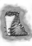
Here is the original sketch from Bobby, and my finished work. 
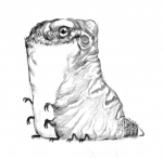
creaturecreature1_AustinLight

The Critique
This was one of my best assignments, and I really felt good about it. I gave it three stars, because I had some shading issues toward the bottom, losing the creature’s feet a little, but overall I liked it.

Bobby agreed and gave me four stars, saying it was an excellent effort, though there were some minor fixes that needed to be made. First, the whole thing needed to be lightened up a bit. The feet were hard to see because the area around them was too dark. Second, I needed to get rid of the dark outlines on the top of the head and along the back. Bobby has commented on my reliance on outlines multiple times, and it is something I’m trying to break away from. The outlines prevent a painting from looking three dimensional. I wish I could show you the finished product from the critique (it’s in video form), because just adding some lighter tones and ditching the outlines makes a world of difference.

In the next lesson we learned more about textures and how they can make pictures really pop.
Digital Painting Lesson 2: Colorizing from black and white

I’m taking a course at Schoolism.com called “Digital Painting with Bobby Chiu.”   The courses are usually nine weeks long and they work like this: each week I watch a video of the lesson—usually around 90 minutes in length—and I have until the following week to turn in my assignment. As I am working on the assignment for the next week, Bobby is grading my previous assignment, which involves creating a video of him correcting and drawing over my work, as well as some tips on what I could do better. He posts correction videos a week later, and I’m free to view it as well as those of my 14 other classmates. The lessons are incredible, and I’m learning tricks and techniques I never knew, and I’ve been using Photoshop for years. Also, you just can’t beat the one-on-one attention from such a well-established artist. I highly recommend signing up for a class if you can. It’s worth every penny.

The Lesson
In the second week of class we learned how to take a black and white image (like the one we did the first week) and add color. Before we started throwing colors down, Billy taught us about the different blend modes in the layer palette and what they do. This was great for me because I’ve been using several of the blend modes over the years to achieve certain effects, but I didn’t really know why the layers do what they do. In this illustration we used normal, color, and multiply blend layers, I think.

We also learned about setting up actions in Photoshop. I knew of actions, but I never used them, and they’re great. Definitely helped saved a lot of time on this assignment.

Instead of using our muscle man painting last week, Bobby supplied us with one of his award winning paintings, minus the color. It was up to us to make it look like it was originally done in color, not a black and white image colored over.

Here is how mine turned out:

Lesson 2 Lesson 2

The Critique
I gave myself three stars again, mainly because I wasn’t really happy with my colors. Bobby’s image (which you can see here, just scroll to the fifth set) is great, but I thought I’d try something radically different. So at first I went with a warm orangey sunset for the overall tone, but it didn’t work out. I think this pic was just meant for cool colors. I liked the idea of zombie-fighting cowboys in pastels, so that’s why I went with the Easter colors. The cowboys gel together for the most part, but some of the colors look a bit off.

Bobby seemed to agree with my assessment. He pointed out two problems: first, my background was too saturated and needed to be toned down. The colors on the cowboys were all right, but he said they were “just on the edge” of being too saturated. Second, he pointed out that my blocking layers could have been a bit cleaner. If you look really close you can see a thin halo around some parts of the cowboys where I wasn’t as precise with my blocking. The image he provided us was a flat jpeg, so I think that was part of the problem—the cowboys kind of blended together in grayscale. If we had a multi-layered psd, I probably would have done a better job with the blocking. Overall, it was a fun, and very educational assignment.

The next lesson is part one of two on textures. I was happy with what I turned in, so I’m anxious to get the critique and see where I can improve. Look for that post in the coming week.

Digital Painting Lesson 1: Visualizing Through Darkness

I’m taking a course at Schoolism.com called “Digital Painting with Bobby Chiu.”   The courses are usually nine weeks long and they work like this: each week I watch a video of the lesson—usually around 90 minutes in length—and I have until the following week to turn in my assignment. As I am working on the assignment for the next week, Bobby is grading my previous assignment, which involves creating a video of him correcting and drawing over my work, as well as some tips on what I could do better. He posts correction videos a week later, and I’m free to view it as well as those of my 14 other classmates. The lessons are incredible, and I’m learning tricks and techniques I never knew, and I’ve been using Photoshop for years. Also, you just can’t beat the one-on-one attention from such a well-established artist. I highly recommend signing up for a class if you can. It’s worth every penny.

The Lesson
Lesson 1: Visualizing Through Darkness. In this lesson we were supplied with a sketch of an over-the-top muscle man and we were instructed to paint him using a palette of five grayscale tones. Using low opacity and flow settings on the brush tool, we had to make multiple light and dark passes until the original sketch was gone and only our painting remained.

Why so dark? Bobby said we visualize better in darkness. Think about it, when you get up for a glass of water in the middle of the night and are startled by a funky shape in the living room, your mind races.

“Is that a coat rack? No it’s not a coat rack, it looks like it has arms…and are those claws? I think it is looking at me…what is it smiling at?”

 Our mind fills in the details in darkness. We visualize fantasy from the mundane. That’s what this assignment was all about, and it was an interesting way to approach a picture.

This was a tough assignment for me, but a great introduction to the world of digital painting. Before, I was just simply coloring my work with solid, flat tones, and adding simple highlights and shadows. That was okay for my cartoony style, but it wouldn’t work here. With the opacity and flow down, I had to think about every stroke I made, just like real painting. I often found myself slipping into coloring mode, which would make my image appear flat. I ended up restarting the picture four times before finally turning it in.

Here is my finished product:


The Critique
When you turn in your work you have the chance to grade yourself, one to five stars (five being the best, natch). I gave myself a 3. It was definitely beyond anything I had done before, but I wasn’t happy with the highlights, and he didn’t seem to pop as much Bobby’s picture. I told him I knew something was wrong, I just didn’t know how to fix it.

Bobby did not disappoint in his correction. He knew exactly what it was I did wrong and how to fix it. Apparently, I was paying too much attention to the details and not enough attention to the overall structure, which makes sense because I usually just color in detailed line work. Bobby said my details looked great but the structure was lacking, resulting in a flat character. He drew two cubes in the corner, one with sharp edges, and the other with more round and organic edges. He pointed out how the structure is the first thing people see, and how every structure is made up of basic shapes. For example, you can really see the individual muscles that make up his thighs, but you can’t really tell that the thighs are large cylinders. He fixed this by lightening things up a bit, which took some emphasis off the small details. He then encouraged me to think about the overall structure in every object the rest of the course. I have been, and you’ll see that in my assignment for lesson 3 I think.

Bobby agreed with my assessment and gave me three stars on the assignment.

In the next lesson, we learned how to color a grayscale image like this one. Stay tuned for that critique.