My Influence map

This is a meme that's been around for a while, but one well worth participating in. We all have different creative influences in our lives. These are mine. They aren't in any order--some influenced me more than others depending on where I was in my life at the time. Some of them continue to influence me, even inspire me at times. What does your influence map look like?

Numbers 1, 3, 4, 6, 9, and 11 are my art influences. You may notice some stylistic similarities between them. They all have a cartoonish, heavily stylized look to them, and they all emphasize smooth flowing lines and detail through simplicity. Number 1, Bobby Chiu, is the most practical influence because I took a class at Schoolism.com taught by him. He gave me personal instruction and tips that helped improve my art a great deal. The art of Penny Arcade influences and inspires, mainly because I’ve been reading the web comic for years and I’ve watched it improve, which is cool. The artist at Penny Arcade, Mike Krahulik, has mentioned Stephen Silver (9) and Ben Caldwell (3) as influences for his art as well. As for Disney’s Aladdin, that was just a watershed moment for me when I was a kid. The animation, the story, the computer animated magic carpet ride (which hasn’t really aged well); it was all amazing to me. I was the only eight year old raving about the quality of animation and design in a movie.

Number 5, video games, influenced me in a number of ways. From the music I listen to, to the stories I’m interested in. I’ve been playing them since I was old enough to grip a controller, so I’m deeply ingrained in game culture. Video game magazines like EGM and Next Generation got me interested in writing and journalism. Watching the technology, storytelling opportunity and industry grow over the years has been a lot of fun. Video games inspire and excite me and it’s great to be a part of the culture as it grows and matures with me. 

That leaves my writing influences.

Number 2 is Stephen King and particularly his book, “On Writing”, which I consider a must for would-be writers. I’ve also always admired King’s characterization skills. He can craft some amazingly deep characters, especially villains.

Number 7 is Christopher Moore. He writes humorous novels, and I’ve read most of them. I like Moore because he writes comedy with heart. He can pull off crass and heartfelt on the same page. His book “Lamb, the Gospel According to Biff, Christ’s Childhood Pal” is hilarious, well-researched, sad, heartwarming and, like many of his books, a tad bit insane.

Number 8 is mythology in general. I took a course on mythology in grad school and it shifted my entire worldview. There’s a weird connectivity in mythology that spans cultures, classes, religions and continents. It’s fascinating. Joseph Campbell, the author of “The Power of Myth” and other influential books on mythology, spent his life drawing meaning from and interpreting mythology. His work has influenced numerous storytellers, most famously George Lucas and the original (as in, not the crappy one) Star Wars trilogy.

Finally there’s number 10, “Life of Pi”. It’s one of the few books I’ve read multiple times, and the only book I have more than two copies of. I think I read it at an important time in my life, because Pi’s journey struck a chord that continues to resonate. I enjoy his quest for spirituality—with his earnest and honest mixing of religions—in the early part of the book as much as I like the harrowing journey at sea with the tiger.

There are other influences I could have included, but I tried to narrow it down to the biggest influencers. I also had to really think about which things influenced me and which inspire me. My inspiration map would be much larger and feature some of the artists and writers above. 
Digital Painting Lesson 7: Vector Art

The Lesson
This lesson was a fun one because I’ve always had an interest in vector art. What’s kept me from acting on that interest has been the pen tool. I hate the pen tool. Correction, I hated the pen tool. Now I love it, and it’s all thanks to Bobby.

See the pen tool is crucial when creating vectors, it allows for crisp, clean edges, scalable shapes, and multiple paths. I’ve tried many times to master the pen tool, I even followed Adobe’s own tutorials in one of their Classroom In a Book lessons and I still couldn’t grasp it. In just minutes, Bobby had me using the tool like a pro. The way he explained it while providing examples totally demystified it for me.

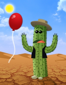
So for this lesson we had to take the sketch below and using just the pen tool (we did bring in some brushes and textures at the end to finish it off), we had to make this cactus come to life. The colored dots on Bobby’s sketch acted as the palette for coloring the scene.

cactuscactus_AustinLight

The Critique
I really enjoyed this lesson; it was fun to see it go from a flat shape to something that pops. The balloon  wasn’t part of the lesson, but after finishing it, and looking at the cactus’ expression, I felt like that would be funny to have in there. Every time I look at it I can just here him screaming, “Ahhhh!” and then blowing as hard as he can to keep it away. I gave myself four stars on this one because I wasn’t sure what to do after adding the balloon. I thought it clashed with the sun and I wasn’t sure if I should keep it in the picture, make it smaller, or just get rid of it.
Bobby gave me five stars (!), a perfect score. His only critique was that it probably would have been a good idea to remove the sun. He quickly took it out with some local colors and the picture as a whole worked much better without it.

This was a relatively easy lesson and it came together quickly, but the things I learned were extremely valuable going forward. I’m working on a children’s book right now for very young children and the simple vector art style is perfect for that age group.

Digital Painting Lesson 6: Custom Brushes

The Lesson
This was one of the most useful lessons, and I learned a lot of things that I'll continue to use and that will enable me to do all kinds of cool things.

The bulk of this assignment was instruction and it centered around the brush palette. Bobby showed us what every slider, button and menu item did and how they can be used to make different brushes. We made three brushes in this lesson: a paint brush, a marker brush, and a hair brush. You can make a brush out of just about any shape by going to Edit-->Define Brush Preset and playing with the settings in the brush palette.

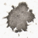
For the paint brush, we used a seamless texture (which he also showed us how to make) to make a brush that appears to be a brush on canvas. To do it, we took the texture below, desaturated it, and made it seamless.

paint-texture2

We attached the texture to two brushes, a round brush and the other to this splatter image (by selecting define brush preset):

splatter

The other brushes we made didn't have textures attached, but could be used to add texture to images.

The marker brush we didn't use, it was just a quick exercise to show us how we could use the brush settings to create something that looks like a marker.

Finally there was the hair brush, one that Bobby said he gets asked about a lot. This one was really cool, and it was simple to make. All it takes is 10 to 12 dots, and a few adjustments to the brush settings in the brush palette.

The hair brush lets you make clumps of hair that really add some depth and realism to a picture. After creating it, Bobby provided us a picture of a bald woman and had us paint hair on her. He painted the bald woman using the paint texture brush, so we used the same texture brush as a base for the hair and then brought in the hair brush for, you know, hair.

Below is the bald woman we were supplied, and next to it is what I turned in. We all had to turn in this hair style and color, though just for kicks and giggles he showed us how we could do darker blond and curly with the same brushes.

bald-womanbald-woman_AustinLight

The Critique
I gave myself three stars because I struggled with the highlights a bit. Overall, I felt like I did a good job though, and it was a really fun and informative lesson.

Bobby gave me four stars (hooray!) and he did a bit of touching up on the hair. He fixed the highlight problems and he brought in some swoopy bangs, which I started to do but I scrapped because I couldn't get it to work right--you can see some of the remnants of that if you look hard. He also went in with a one pixel brush and added a few stray hairs. If there's one thing I've learned in this class it's that those tiny subtle touches are what really sell the picture.

Digital Painting Lesson 5: The Smudge Technique

The Lesson
This week was all about the smudge tool, that little finger icon over on the toolbar that smears pixels around. I've toyed with the smudge tool before, but I've never found a real practical use for it--turns out, I just wasn't using it right.

Our assignment was to take a line art drawing and transform it into a painting with the smudge tool, with a little help from some brushes in the end. Bobby said that most people don't use the tool alone (at least he doesn't), but he wanted us to in this lesson so that we could get a good feel for it.

Before we started using the tool, we had to get it set the way Bobby uses it. He provided this handy chart for the settings below.

Smudge tool settings Smudge tool settings

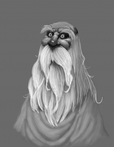
After that he taught us how the tool works, which is really  quite simple. Moving perpendicular between two lines will smudge them together, while moving parallel along a line will soften or blur it. With this basic functionality in mind, we were told to smudge this old man to life.

The smudge tool did most of the paint and shading work, but we used brushes for the beard (in the next lesson we made a custom hair brush, but for this lesson it was one hair at a time), some of the cloth in his shirt, and to add some highlights on his face.

Below is our starting picture and what I turned in.

oldman oldman_AustinLight

The Critique
I gave myself three stars on this one and so did Bobby. I had to redo the beard because the first time it didn't look like hair, but clumpy pasta. My final image still looks a bit clumpy to me, but it was the best I could do in the time I had. Like lesson three, Bobby pointed out my reliance on outlines as he smudged away the bright white line on the right and some of the lines on his head. He also added more individual hairs and some paint underneath the beard to give it a fuller look.

I have had to constantly remind myself to slow down and not get frustrated in this course. With the exception of the final video, all the lessons are less than two hours. Bobby is a pro and he blazes through these paintings with quick, precise strokes that make digital painting look far easier than it is. By the time I got to this lesson I finally learned to not try and match his pace, but to focus more on matching his technique. This one was great for that because the smudge tool can really mess things up if you're to fast and heavy handed. I took it nice and slow (after the intial pasta beard), and it went much smoother.

The next lesson on custom brushes was even more interesting and very informative. I'll share it with you as soon as I get my critique back.

Digital Painting Lesson 4: Textures, Part Two

The Lesson
Instead of painting with textures like we did in lesson three, this lesson was about applying textures to a painting. Bobby gave us a rough painting and we had to “finish” it with the textures he supplied.

Applying textures involves a lot more than just slapping them on a picture and switching the blend mode to overlay—at least if you want them to turn out nicely and really look like part of the picture. We worked with four textures here: two that made the cave (simple photos of rocks), one for the cracked ground (an actual photo of cracked ground) and another for the kangamolebunny’s skin (Bobby made this one from a picture of a naked mole rat). Applying them required warping, twisting, modifying and painting to get them to look right. All the textures were applied with a layer mask so that we could control the opacity, tone, saturation and more of each one.

Below you’ll see the rough painting we were given and my finished product.

kangamolebunny kangamolebunny_AustinLight

The Critique
I wasn’t very happy with the way my overall painting turned out. I really liked the creature, but the cave was no good. The area where the light hit the wall was blurry and the shadows I made looked too contrived. I wasn’t exactly sure how to make it look better, so I turned it in as is and gave myself three stars (I wanted to go with two, but Brooke convinced me to add another).

Bobby agreed with my wife and gave me three stars as well. He said my creature was good but there were some areas that needed to be lightened up and more defined, and the ears needed more hair. For the cave, he went through and showed me how to make some craggy, organic surfaces, and make the lighting look more realistic.

When I started this lesson and saw Bobby’s finished product, I thought there was no way I’d be able to create something like it (I tend to think that before most of these lessons, but his instruction is so good that a week later I’m turning in pretty good stuff). Though I wasn’t too thrilled with my finished product, I learned a great deal about textures and how to incorporate them into a painting without it looking all digital and fake.

I’ve already received the critique for the next lesson on the smudge tool, so I’ll have that up by this weekend.