Advanced Character Design with Stephen Silver Part 7

After a bit of a delay (things got hectic late September to early October with my book launch), we're back on track. I finished the course a few weeks ago, and overall it was fantastic. I learned a lot and I can see an improvement in my art. Totally worth it.

Here is the second to last lesson.

For this assignment we were tasked with turning a celebrity into an animal. In the lesson, Stephen turned Steve Buscemi and Sylvester Stallone into birds. The point of the exercise wasn't so much about creating a celebrity likenesses, but more about finding inspiration for character designs from real people. 

His final birds didn't look exactly like those actors, but if they were voiced by them, you'd make the link. Stephen showed us a few examples of characters that took inspiration from their famous voice actors, and the likenesses are usually pretty subtle. 

Just like with previous assignments, I wanted to challenge myself. My wife suggested I draw Kevin Hart, her favorite comedian. I figured because of his stature, I'd turn him into an otter. It wasn't easy!

First I Google image searched him.

Hart reference.png

Then I tried to find his most defining features. What things would you need to see in an animal to connect it to Kevin Hart?

With these loose sketches and notes (and a random doodle of an otter), I was ready to take on the image. Here's what I ended up with:

Not bad! If this otter was voiced by him, I'd totally believe it. In Stephens' feedback, he agreed that this was a challenging celebrity to take on, but he made some solid suggestions that would sell the likeness even more. 

Next week I'll post the final assignment! Since the class ended, I've been going back and cleaning up some of my assignments based on Stephen's feedback. I'll cover those after I'm done with the class posts. Until then!
Advanced Character Design with Stephen Silver, Part 5

This lesson was all about observation. Actually it was about drawing from reference, but the bulk of the time was spent watching Stephen watch other things and then draw them. That might sound boring to some, but I thought it was super fun.

He started with still photos, just drawing random people in random pictures. Then he moved to YouTube. The first video he pulled up was from Disney’s Sword in the Stone. He would pause the video at random moments and draw the characters on screen. Sometimes he would go for an exact likeness, other times he’d get the same pose, but change the character.

His video was sped up a bit so it looked like magic whenever he would pause and draw something amazing. I followed along, pausing his video and scribbling out my own version each time. I never stopped for more than two minutes, which forced me to try to find the essence of each image fast. The pace and variety kept it fun.

After Sword in the Stone he switched to sports. He drew some boxers and some sumo wrestlers—all from just random videos on YouTube. Again, sometimes they were exact likenesses, other times he turned them into animals or different people.

Our assignment was to draw someone from reference, which was easy enough—I just had to pick a person. I went with old school wrestler Captain Lou Albano. My 4 year old likes to watch the Super Mario Bros Super Show on Netflix. It’s a show that I loved back in the early 90s. Unfortunately it did not age well. It’s really terrible, but in a kind of great way.

So I took a screenshot of the episode where Lou Albano, who plays Mario, shows up as himself, with a bucket of chicken.

captain lou

I sketched out three iterations of Lou. The third one was my favorite (and that’s the one I turned in). You can click on these for larger versions. 

Here’s Stephen’s feedback. He didn’t have much to change, instead he offered some tips on how I could change up or iterate on my design.

I really like playing with the straight against curve style, and I’m super happy with this picture. I’m not sure it’s a style I would have explored before this class, and I’m really glad I did. Five lessons down, four more to go! 

Advanced Character Design with Stephen Silver, Part 3

The third lesson in Stephen Silver’s Advanced Character Design course was all about caricaturing. Stephen stressed how strengthening your caricature skills can help you design more interesting characters. So our assignment was to take a celebrity and caricature them.

I kinda cheated on this one and turned in two. I started with Josh Gad, but he felt too easy. His features are pretty easy to caricature. He was fun to draw, but what’s the point of taking a class with Stephen Silver if all I’m going to do is turn in work I know is a homerun? I'm in this to push myslef! Here’s my Josh Gad sketches. He’s a fun guy to draw: 

josh gad

After that, my wife suggested I try Jon Stewart (after hearing me lament the end of his Daily Show run all week). I’ve been watching The Daily Show for years, so I felt like I understood the “feel” I needed to hit. That’s something Stephen pointed out in the lesson, by the way. If you can see the subject you’re caricaturing in action, you can pick up quirks that can inform your drawing. If the likeness isn't spot on, but the "feel" is, you're good to go. 

Turns out Jon Stewart was pretty hard to nail. I spent a couple sessions just watching his show and sketching him, trying to pick out the features that made him Jon Stewart. Then I sat down with a ton of still images and started narrowing it down. Here are the sketches I posted on Instagram.

Jon Stewart sketches

And here’s the final image: 

Jon Stewart

I included my sketches when I turned in my work so Stephen could see how I got to my final picture. Here’s the feedback from Stephen:

I’m not going to lie, it feels kind of awesome when someone like Stephen Silver says you did a great job. I think he definitely helped refine it a bit more. I struggled a bit on the final image with the age. When I first finished it, Brooke said it looked like Jon Stewart from 2005, not 2015. So I kinda went in there and sagged a few things down. It sorta worked, but I think Stephen’s tweak to the nose is what really sells it.

That’s it for week three. Lesson four was all about drawing women. Our assignment was to draw one waitress with three body types. I’ll have that feedback up next week along with a bunch of practice images.

Advanced Character Design with Stephen Silver, Part 2

The assignment this week was to draw a character to fit into a show of our choice. Stephen said art directors want to see that you can conform to a show’s style. So this assignment would be good practice.

During the lesson, Stephen showed off the styles of several shows he worked on, as well as some character development concepts he’d done in the past. At one point he pulled up a random picture of a 1920s business guy and drew him in the Kim Possible style. Then he redrew that same guy in the Danny Phantom style. Watching him just flip between the two styles was kind of amazing, plus it served as a great example of how some very small established rules can ripple out to create a cohesive style.

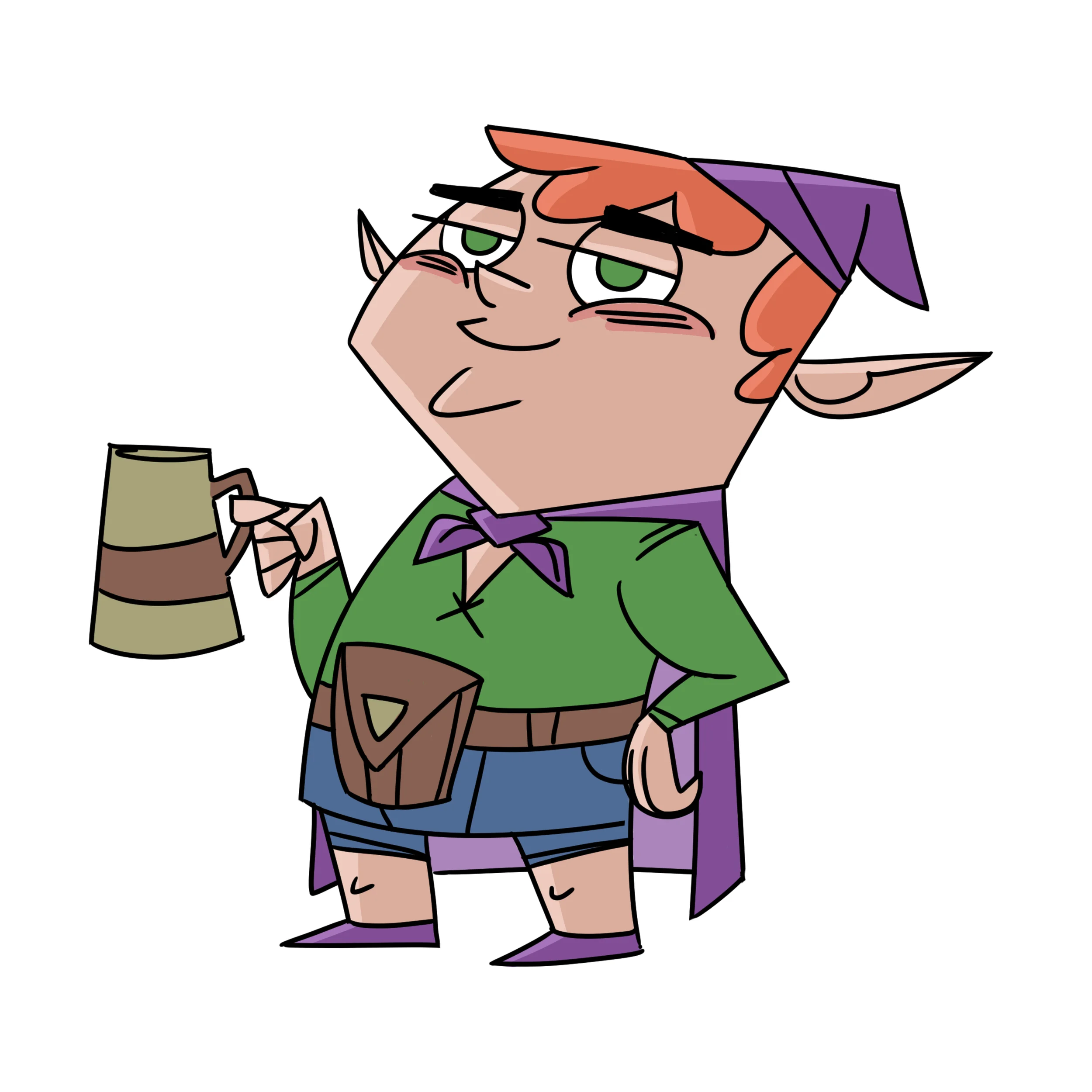
As an animation fan, and a father of two small boys, I’ve seen a lot of cartoons. I ran through several that I thought about trying—Gravity Falls, Rescue Bots, Kung Fu Panda. Before committing to one for the assignment, I decided to try a style out for fun. I went with Fairly Odd Parents, a show that I’ve always thought had a really clear style, and drew this picture of Taako from The Adventure Zone podcast.

Taako

That was a fun exercise, but I wanted more of a challenge. While that picture doesn’t fit perfectly in the style of Fairly Odd Parents, it’s pretty close. One more iteration and I’d get it I think. I wanted to take on something a little tougher. Something with rules that were a little harder to define.

So I went with the Mickey Mouse shorts on YouTube. My oldest son and I watch at least one of these a day. I love them. They’re so weird, and charming, and the way they stretch and pull such classic characters in crazy ways is fun to watch. Also, the backgrounds are gorgeous.

Before working on my characters, I did some research. Most episodes have at least one or two random side characters with unique designs, so I pulled screenshots of several of them. Like Stephen did in his lesson, I started tracing over some of them to try and break down the style.

Research

Research

It was hard.

Unlike the straight against curve design of Fairly Odd Parents, there wasn’t an easy baseline theme that all the characters adhered to. And yet there was definitely something, because they all fit.

So I designed three characters: a boxing kangaroo, a landlord bulldog, and a traveling lama.

Mickey Shorts character designs

I was as eager to hear Stephen’s feedback as I was to see him break down the style too. I was not disappointed. Here’s the feedback:

See what he did with that kangaroo? Amazing right? It’s clear he’s been doing this kind of work for a long time. When I drew these, I was focused inward. I drew the general shape of the character and filled it with detail—because from my research, they all had really clear silhouettes, and I wanted to maintain that. But Stephen pushed outward, and his ended up fitting the wacky (a great word for this style) tone even better.

After watching his feedback, I went back and re-watched a few Mickey shorts and could already see how his interpretation of the style would work. I’m definitely going to try to do some more. It’s a good skill to have, and seeing him so easily break a style down and produce something that would fit made me want to polish my skills so I can do that too someday.

That’s it for this week. Our next assignment is to caricature someone, because being good at caricatures can actually be super helpful when designing characters. I’ll have that feedback next week!

Advanced Character Design with Stephen Silver, Part 1

Two weeks ago I started Advanced Character Design with Stephen Silver over at Schoolism.com.

Stephen Silver is an incredible character designer and it’s a real treat to get to learn from him.

Our first assignment was to draw a cowboy using the things he went over in the first class (basically an overview of Character Design 1, which I skipped). He talked a lot about the golden ratio of 1:1:1.68 and how to use it to get an appealing design.

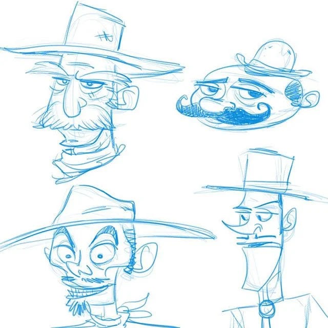
I first drew a bunch of cowboy faces to loosen up and play with some different shapes.

cowboy faces

I knew I wanted a cowboy villain after I explored that one on the bottom left. I also knew I wanted him to wear a cool duster jacket.

So I did some research and started iterating as seen here:


I turned in the image below along with this description (because a character isn’t just a drawing):

I wanted him thin and sleazy, the kind of guy who thinks he's put together, but wears an old duster he stole from a man he killed 10 years ago. He might look refined to criminals, but he's still a dirt bag.

Cowboy

Stephen liked where I was going with it, and offered some tips on how I could push things—his arms, his hat, etc.—to make him even more appealing. He also helped eliminate a few tangents.

Here’s the full video of his feedback. Pretty cool how just a few minor tweaks make a picture dramatically better. I feel like this guy was probably just one version away from hitting the mark, so I’m gonna consider that a win.

Because art directors want to see that you can work in an established style, our next assignment is to create a character and draw it to fit in a show of our choice. I’ll have that feedback in another week or so.