Advanced Character Design with Stephen Silver, Part 1
/Two weeks ago I started Advanced Character Design with Stephen Silver over at Schoolism.com.
Stephen Silver is an incredible character designer and it’s a real treat to get to learn from him.
Our first assignment was to draw a cowboy using the things he went over in the first class (basically an overview of Character Design 1, which I skipped). He talked a lot about the golden ratio of 1:1:1.68 and how to use it to get an appealing design.
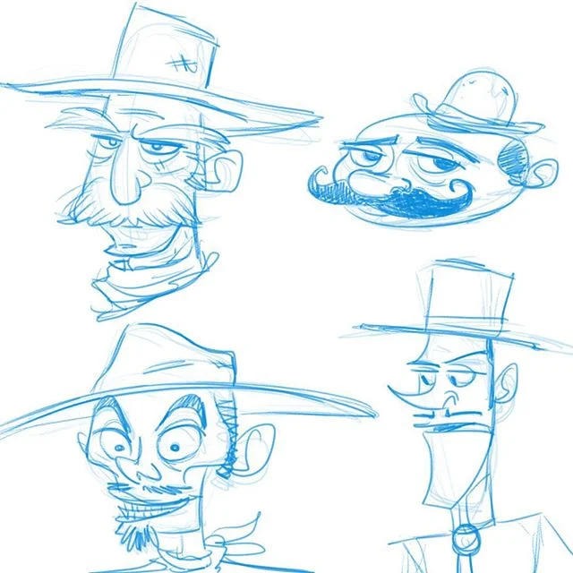
I first drew a bunch of cowboy faces to loosen up and play with some different shapes.
I knew I wanted a cowboy villain after I explored that one on the bottom left. I also knew I wanted him to wear a cool duster jacket.
So I did some research and started iterating as seen here:
I turned in the image below along with this description (because a character isn’t just a drawing):
I wanted him thin and sleazy, the kind of guy who thinks he's put together, but wears an old duster he stole from a man he killed 10 years ago. He might look refined to criminals, but he's still a dirt bag.
Stephen liked where I was going with it, and offered some tips on how I could push things—his arms, his hat, etc.—to make him even more appealing. He also helped eliminate a few tangents.
Here’s the full video of his feedback. Pretty cool how just a few minor tweaks make a picture dramatically better. I feel like this guy was probably just one version away from hitting the mark, so I’m gonna consider that a win.
Because art directors want to see that you can work in an established style, our next assignment is to create a character and draw it to fit in a show of our choice. I’ll have that feedback in another week or so.


