Frontier Communications
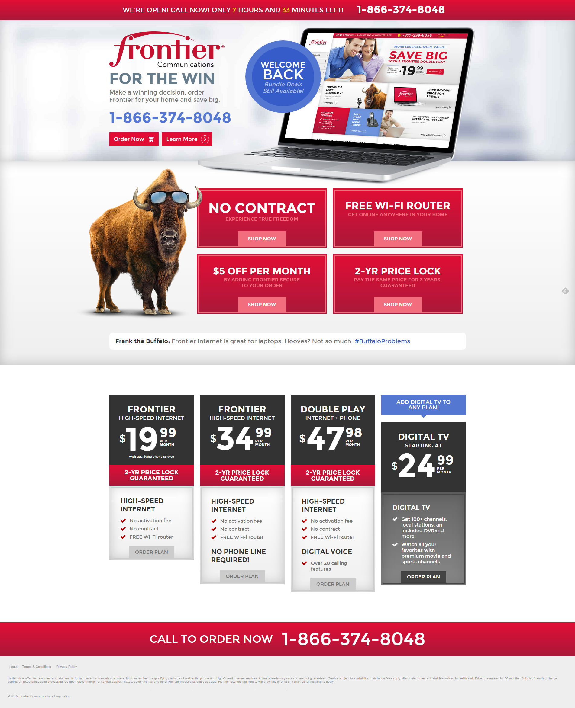
The first Frontier page is a landing page seen only by customers who visited the site, then came back. Return customers are usually price and feature comparing between providers, so the messaging is around making the right decision. The tech behind tracking a user isn’t new, but it still creeps most people out when they’re reminded of it, so I leaned into the deals and the playfulness of Frontier’s mascot, Frank the Buffalo--hence the conversational “Frontier for the win” headline and the cheeky #BuffaloProblems tweet from Frank.
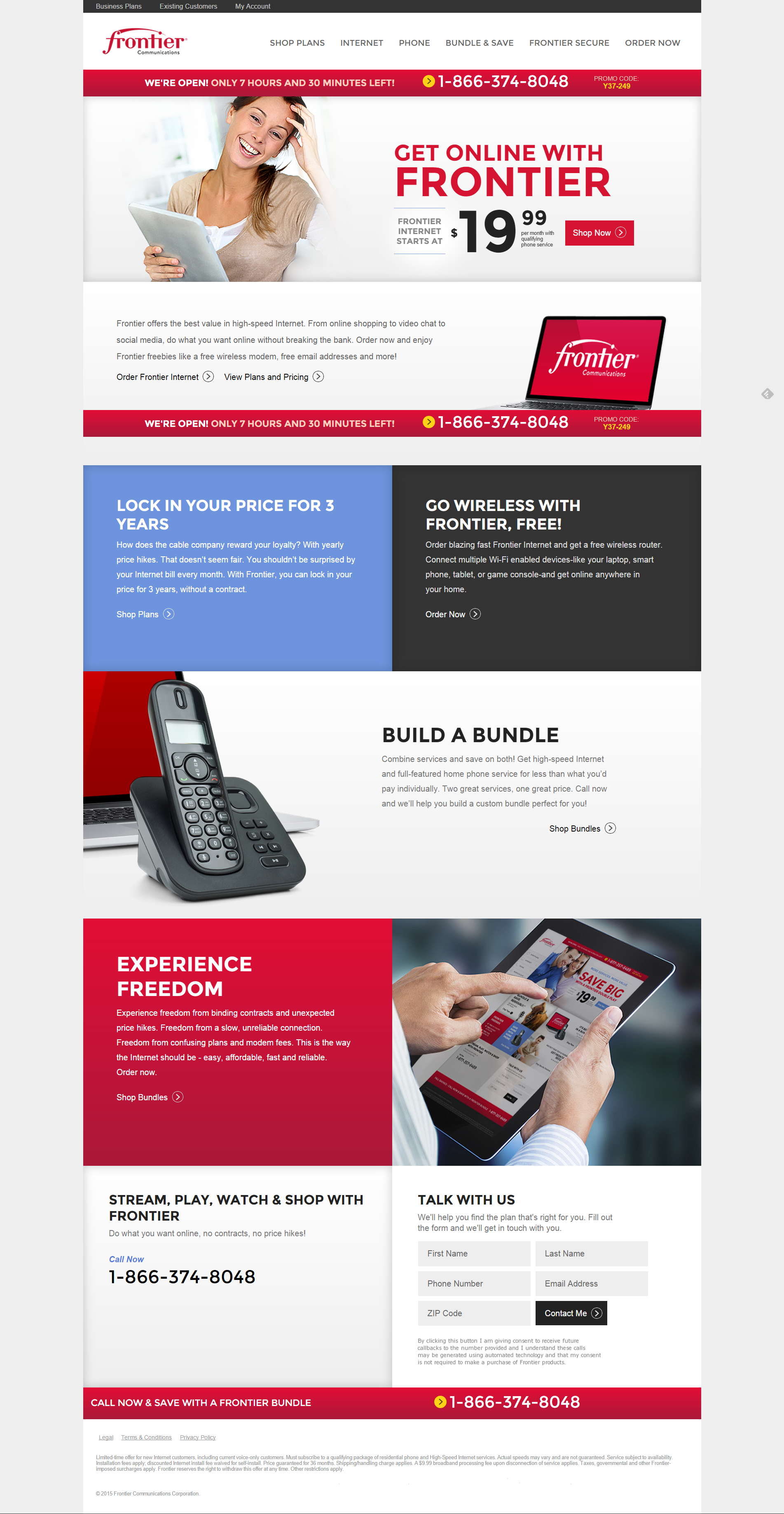
Because the return visitor is comparison shopping we hit them with all the most important value props and price points right there on that return landing page--no need to click around to find what they want. By clicking “Learn More” they’ll move to something like the second page, which is one of the interior pages selling Internet. I only like to use “Learn More” as a CTA when I have a decent chunk of content and/or actual prices, otherwise I’d use something more direct, like “Shop Now.”
The second page covers Internet service from Frontier and how it differs from cable. Because Frontier speeds (in the region this particular page was selling in) couldn’t always beat cable, I leaned into their excellent customer service and their no-contract price guarantee.


